A little rough in its current form if you’re someone toggling collapsed mode. Not sure exactly what caused it, but I wound up with the page getting wider a time or two while I tried it out. I’m sure that it’s actually pretty desirable for image-heavy uses, such as your example of Reddit. Would not have guessed that it could be pulled off with just some lines of CSS, but I don’t know web dev.
So I’ve been using this view and I like it but one small issue I can’t figure out how to fix is word wrapping in the frames. Words keep getting split between lines and making things hard to read sometimes. Is that something I can fix with the custom css?
edit: I should have mentioned I am running the dynamic docker setup and I restarted the containers a few hours ago.
I’d suggest using word-wrap: break-word; instead of word-break: break-all;. This makes words only break if they are really wider than the container. Short words are not affected. So you might then also remove the restriction to links.
Feel a bit guilty since I gave feedback and disappeared.
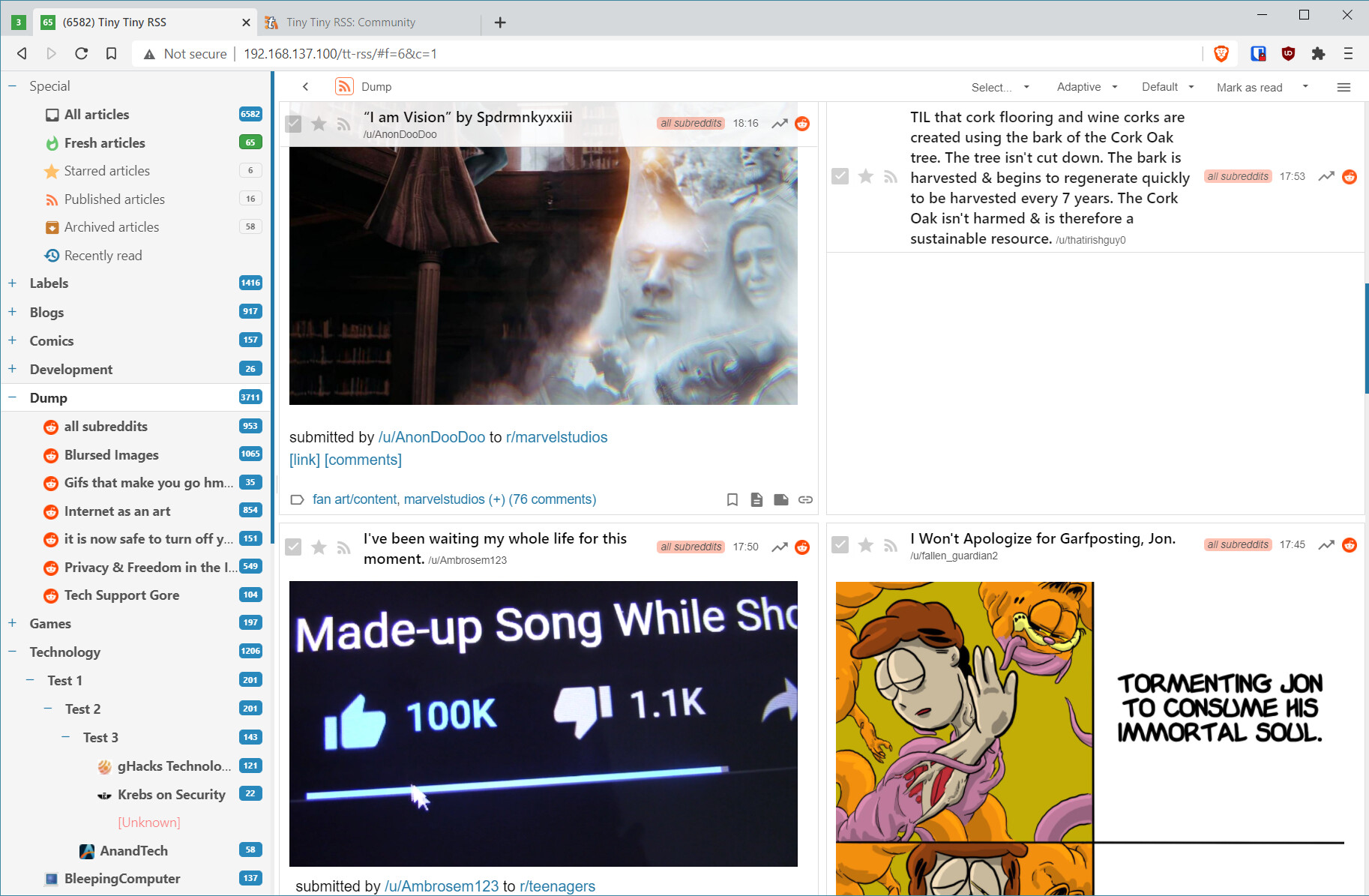
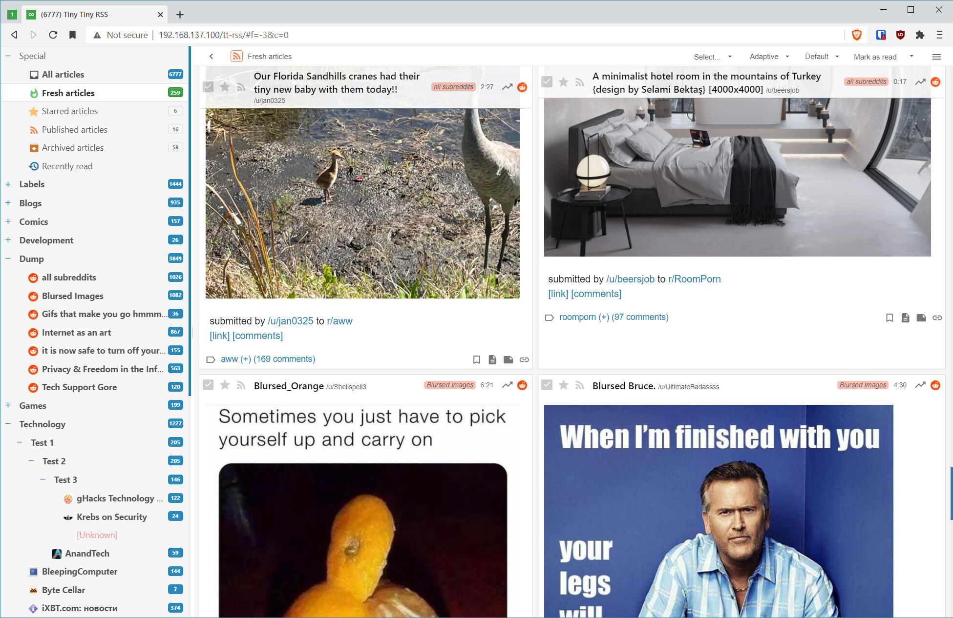
I have an image heavy feed I’m very far behind on, and your first post made me try out expanded instead of collapsed. Sped things up immensely because apparently marking posts as read when you flip through them was CPU heavy on my server.
After that, columns just made things even faster for me.
I did run into an edge case that most people probably wouldn’t have even noticed, where a headline would be top-to-bottom in one column at 1080p, so I ham-fisted some CSS to set a max-height on titleWrap.
Thanks so much for this feature, fox. Didn’t even know I needed it.
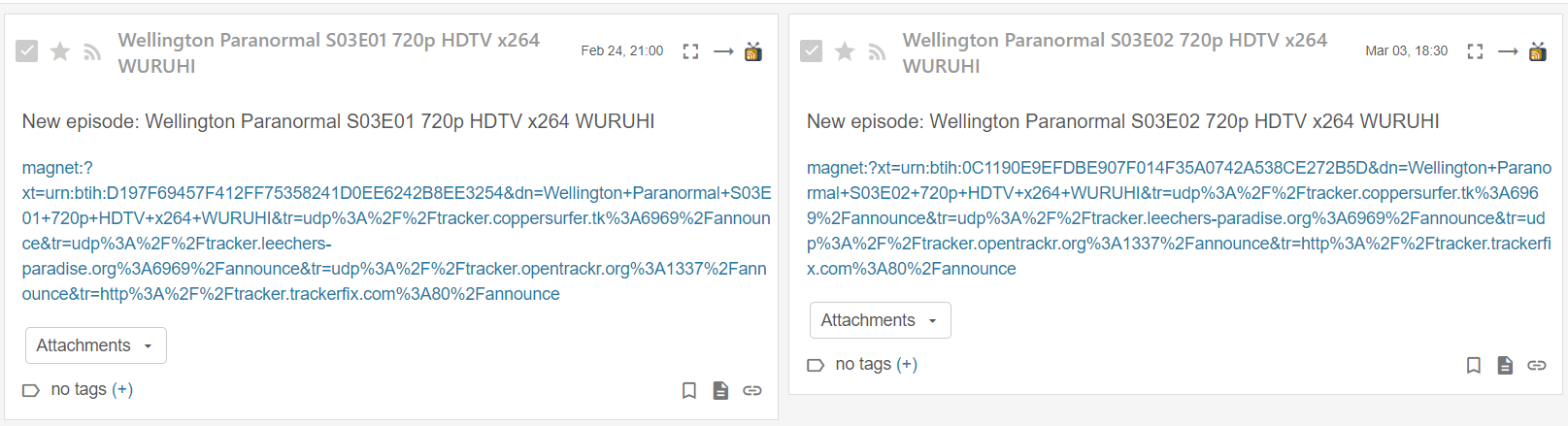
Sorry to resurrect this old thread. I’ve really grown to love grid mode but I noticed the article headlines sometimes break words on to separate lines. It seems to happen with all themes. I don’t have the masonry plugin active either.
Thanks for confirming. I will take the occassional headline issue over breaking the layout. I’ll use this as a chance to learn something and if I come up with a fix I’ll let you know.